Restaurant brand identity
Many people throw around the word “branding” when they talk about starting a small business. But what does it really mean and what restaurant branding identity might be right for your business?
Branding is the way you portray yourself to the public. It’s your DNA, who you are as a company, and the promises you make to your audience. It is what you show people and what they see when they look at you. When it comes to a visual identity, restaurant branding includes things like colors, logo, menu design, interior design, staff uniforms, and a whole host of other elements. A craft brewery, a high-end restaurant, and a classic diner are all going to have very different looks. What sets these things apart from one another?
Creating your visual identity
The thing that most people tend to think of when they think of brand and visual identity is the logo. It will be the first thing consumers see. It also can help inform the rest of your design choices, especially when it comes to color. You don’t want your logo to clash with any other element of your restaurant design. Think carefully about your restaurant concept and key brand promise before choosing your design elements. You may want to hire a graphic designer or a marketing firm to help you create your logo and visual identity. While you can refresh your logo and color scheme later, it’s important to start off with a strong brand and a unique look.
Color is an important building block of any visual identity. Different colors mean different things, and many types of colors match up with different types of restaurants.

Bright, primary colors
Many fast food restaurants use bright, primary colors. They are seen as simple and fun and can brighten up a space.

Jewel tones
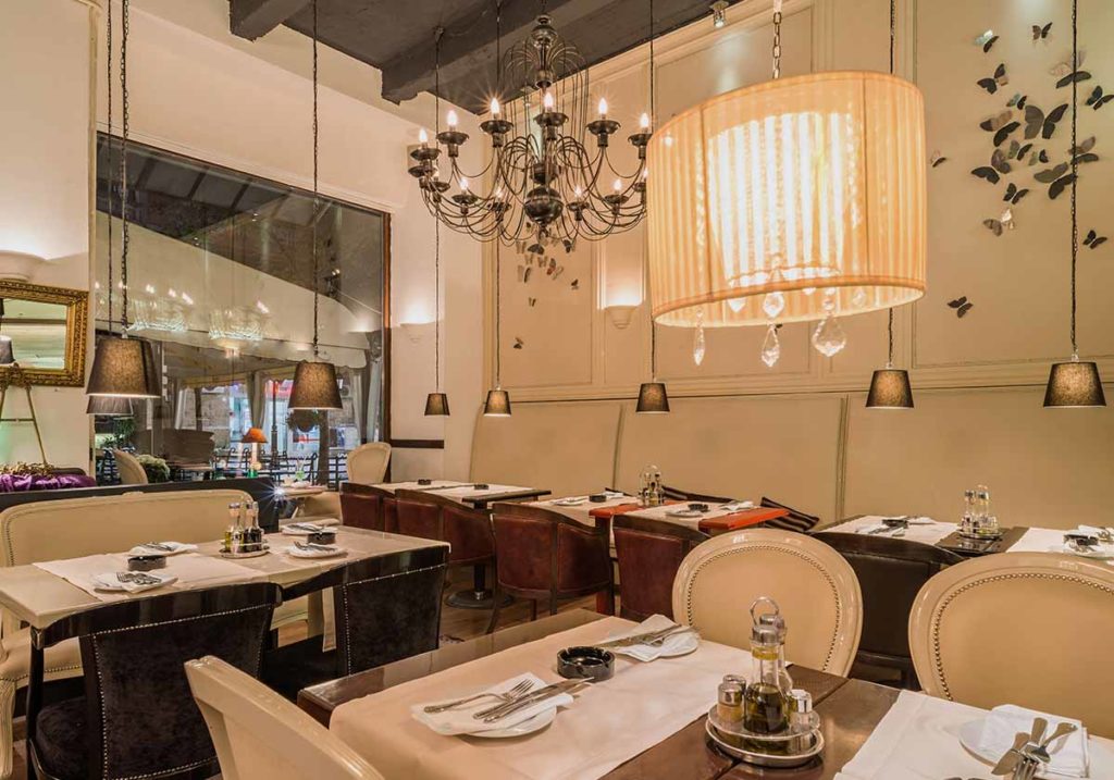
Higher-end restaurants often use jewel tones (like sapphire blue or emerald green) in their color scheme. They are seen as sophisticated and reserved.

Earth tones
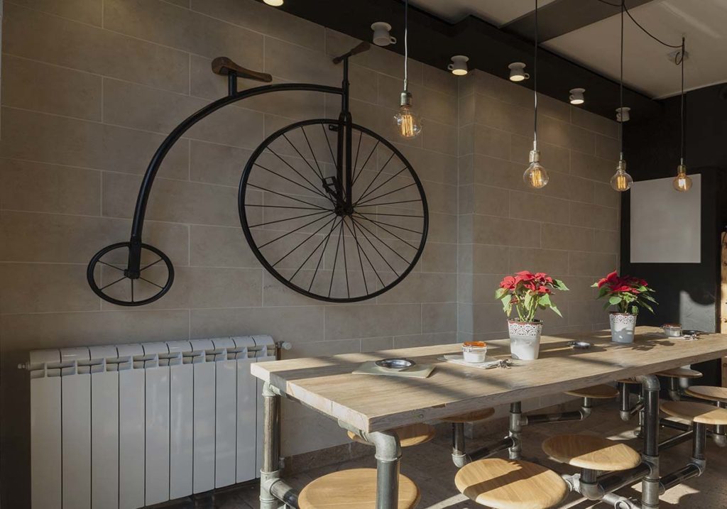
Earth tones and neutral tones are used for more rustic or modern themes. They are homey and warm.

Bright, non-primary colors
Bright colors are fun and funky. They are often used in a variety of street-food style restaurants.

Black and white
Simple and elegant. Black and white is understated and often used in a minimalistic sort of logo. Use an accent color or two to keep things from getting too monotone.

Metallic colors
Gold, silver, copper, etc. Like jewel tones, metallic colors are often associated with the high end because they resemble precious metals.
Considering your typeface is critical to creating your visual restaurant brand: What does it convey when a logo and headings are in a handwritten font? Something blocky and thick? Thin and new-age? Elongated, Prairie-style?
Think about the kind of atmosphere you want in your restaurant and try to match that. For example, a fine-dining restaurant might use an elegant, calligraphic font. Compare that to a chunky, playful font for a family restaurant or a thinner, more chic font for a bistro or bar.
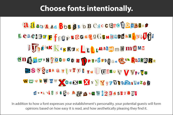
Font pairing is important too. It’s possible to use something more elaborate alongside something readable, which is essential on your menu. Keep in mind the light level of your restaurant. If you run a dimly lit bar and grill, for example, your font may need to be larger or simpler.
How to apply your brand identity
After you’ve decided on your basic building blocks, it’s time to think about the rest of your restaurant. How will your color and font choices play into the rest of your design?
Do you want your staff’s uniform to match the color scheme and level of formality you have created? For example, the servers at an expensive steakhouse might not wear jeans. A more casual restaurant might use a quirky tee as part of their uniform, or an apron in matching colors.
You might also forgo the uniform and ask your staff to dress in specific colors. A restaurant with an ocean theme may want their servers and hosts in shades of blue, while a family restaurant may require all black.
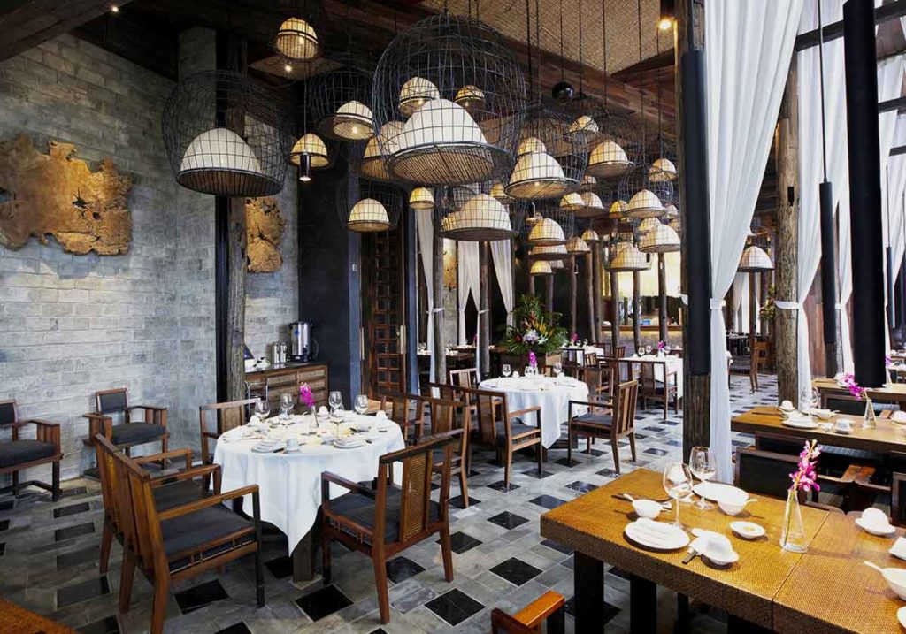
The décor of a space is often one of the first things a person notices when walking into a restaurant. Be sure to consider how you weave your restaurant brand throughout your dining room, but don’t overdo it.
Each of these choices should tie into the rest of your design choices as part of your overall restaurant branding strategy.
You can also use restaurant branding items on your menu, highlighting a feature dish with a special color, shape or icon. These small flourishes can make your restaurant stand out in the mind of your customers.
Using your brand in practice
Now that you’ve made some choices about what your brand will look like, how do you use it? As with everything else, the vibe that you want should extend to your advertising. Here are some things to consider as you decide where and how to create brand awareness for your restaurant:
Social media is a space to communicate directly with your customer and invite them to interact.
Use advertising as a more distant and information-heavy form of communication with your customer.
A combination of social media and traditional advertising is key for garnering business.
Social media is a great place to develop a voice for yourself. A casual restaurant may want to post fun, inviting things with a laid-back tone. A fine-dining establishment may want to use more elegant, less casual language and photos. Either way, the goal of social media is interaction.
You want people to like and share your posts, review your restaurant, ask you questions, and follow your account. No matter what kind of restaurant you own, your social media should be approachable. Use simple language and try to avoid slang, even if you run a casual restaurant. Include a lot of restaurant photography, especially of your space and of your food. Include areas on your social media sites for your customers to interact with each other and tell you what they liked (and didn’t like) about your restaurant.
Advertising is the other way you can project your brand. It’s a lot more structured than social media and there is less interaction. Consistency is key. If your style jumps around between advertisements, you can create confusion about your brand in the marketplace. Make sure you have a set of brand guidelines and stick with them to ensure your customers and potential customers have the same brand experience with your restaurant, regardless of where they find you.
For radio ads or social media videos, use music that matches your image. For example, a fine Italian restaurant may use some classical Italian music in a commercial, while a chain family restaurant may choose a pop song or a catchy jingle. For print or digital advertisements, include pictures or video that showcase what makes your restaurant unique, special, and memorable — which could be your location, food, staff, etc.
Restaurant branding is another way to think about the impression you want to give customers. Your brand will develop over time as you figure out what matches your business. The important thing is to be consistent and ensure your customers and potential customers know who you are and what promises your brand is making.
Rewards Network® does not provide tax, legal, or accounting advice. This material has been prepared for informational purposes only, and is not intended to provide, and should not be relied on for tax, legal, or accounting advice. You should consult your own tax, legal, and accounting advisors before engaging in any transaction.
